Hello blog viewers,
I have just completed the fifth week of my SRP, last week being my spring break. This week, I spent a lot of time on the core data for the app (where all the user’s answers will be stored into the app) and started learning (raywenderlich.com has been a great help again) and working on coding some core graphics. Core graphics are displayed in a UIView. They can be coded to display a visual image, hence the “view” in UIView. For example, I can code a circle image with the line of code:
override func drawRect(rect: CGRect) {
var path = UIBezierPath(ovalInRect: rect) UIColor.greenColor().setFill() path.fill() } |
Although this code does say “oval”, if I set the view’s width and height equal to each other, then the “oval” will look like a circle. This code also shows how to set a basic color for the circle. Custom colors can coded using UIColor(red: x, green: y, blue: z, alpha: w). I use this website: http://uicolor.xyz/#/hex-to-ui in order to pick a color and get values for x, y, z, and w. An example of this is  equalling UIColor(red:0.12, green:0.83, blue:0.88, alpha:1.0). With this simple line of code and a website, I have access to any color I want.
Although coding core graphics is an optional part of this app, I think that it will produce a more dynamic user experience since users will be able to visualize questions and their answers more. For example, I have started working on a moving image that will better visualize when a slider is used.
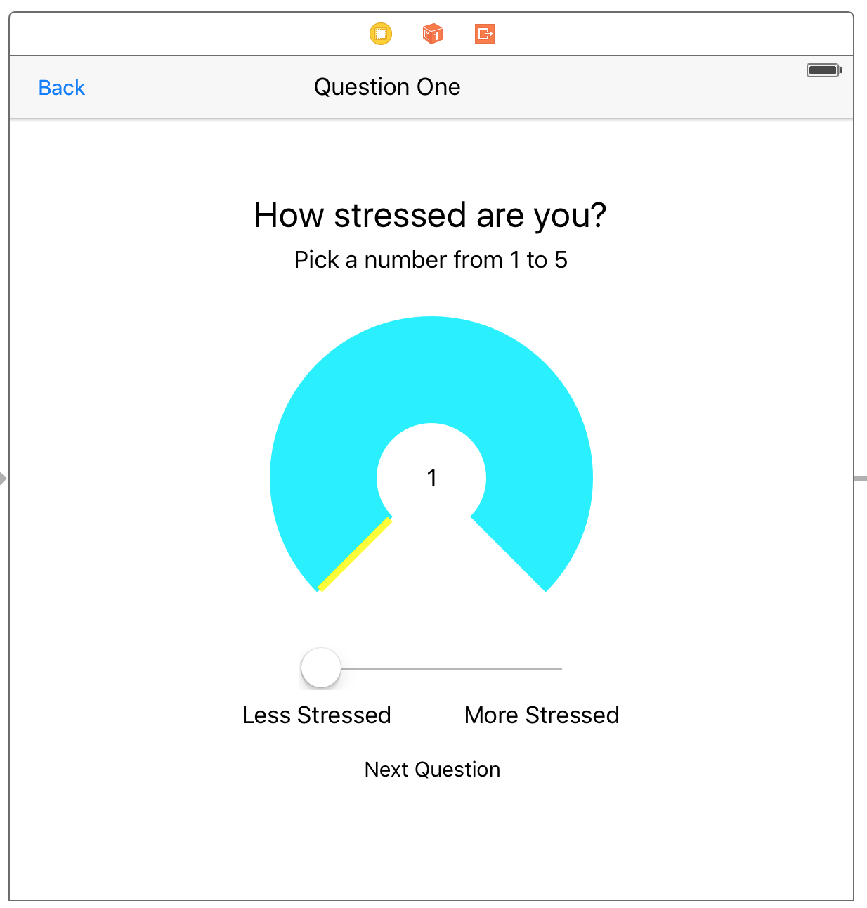
When the user slides (the slider) left to right, the yellow bar in the UIView (with the 3/4ths circle) will move left to right to show an increase in the stress value along with the number in the center showing the exact value. So far, I have only coded the UIView, but have not been able to make the yellow bar coordinate with the slider proportionally. Coding the core graphics of the UIView required some math in order to code part of the circle and not the whole circle.
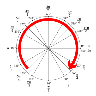
I had to code for the “stroke” to have a starting angle of 3π/4 and ending angle of π/4. This results in a 270º angle circle. After that, I coded for the outline (the yellow part) of the 270º circle.
These next few weeks both are exciting and stressful since many colleges are releasing their regular decision admissions. While stressing over college decisions, I will continue to work on core data of the app and working on adding core graphics to more parts of the app, including the main “stressed?” button. I hope to see you all in my next blog post!
I like the the ability to visualize it all better. I have to admit that the unit circle is confusing since it goes clockwise, so I am glad that you are doing the programming. With the college admissions coming out soon and the stress related to that, is your app functional enough to record your own stress levels?
ReplyDeleteThank you! I was hoping that the app would be more interactive and enjoyable with more visuals and animations. Unfortunately, I have not finished and finalized the list of questions I will ask in the app. Along with coding the app, I am also researching more stress causes this week. When the app is complete, I hope to have a balanced set of questions that will gauge users' stress patterns without overwhelming them with too many questions.
DeleteLooks great Saif! Do you anticipate using the unit circle again when you work on the actual stress button next week?
ReplyDeleteWhat does the timeline look like for you for the remaining weeks of your project? You seem to make significant progress each week!
ReplyDeleteIt's amazing to see the amount of progress you've mad in a week. Do you think you'll have your app beta tested soon?
ReplyDelete