Wednesday, May 4, 2016

Screenshots

Hello blog viewers,

Here are a few screenshots of my app. With a few minor updates, I plan to submit it to app store for review before it can be released!


Thanks for reading!

Friday, April 22, 2016

Powerpoint

Hello blog viewers,

I have inserted a link to my presentation below. My app, 'Stress Insights', is in its final stages. I will update the powerpoint with a video demo of the app before my presentation on Saturday, May 7th.

Here is the link:

Stress Insights Presentation

 I'd like to take this opportunity to thank my faculty advisor, Mr. Peacher and Ms Connor for their  advice and tips!

Thank you for your support.

Saif

Saturday, April 16, 2016

Week 9 (Apr 11 - Apr 15)

Colors Speak Louder than Words


Hello blog viewers,


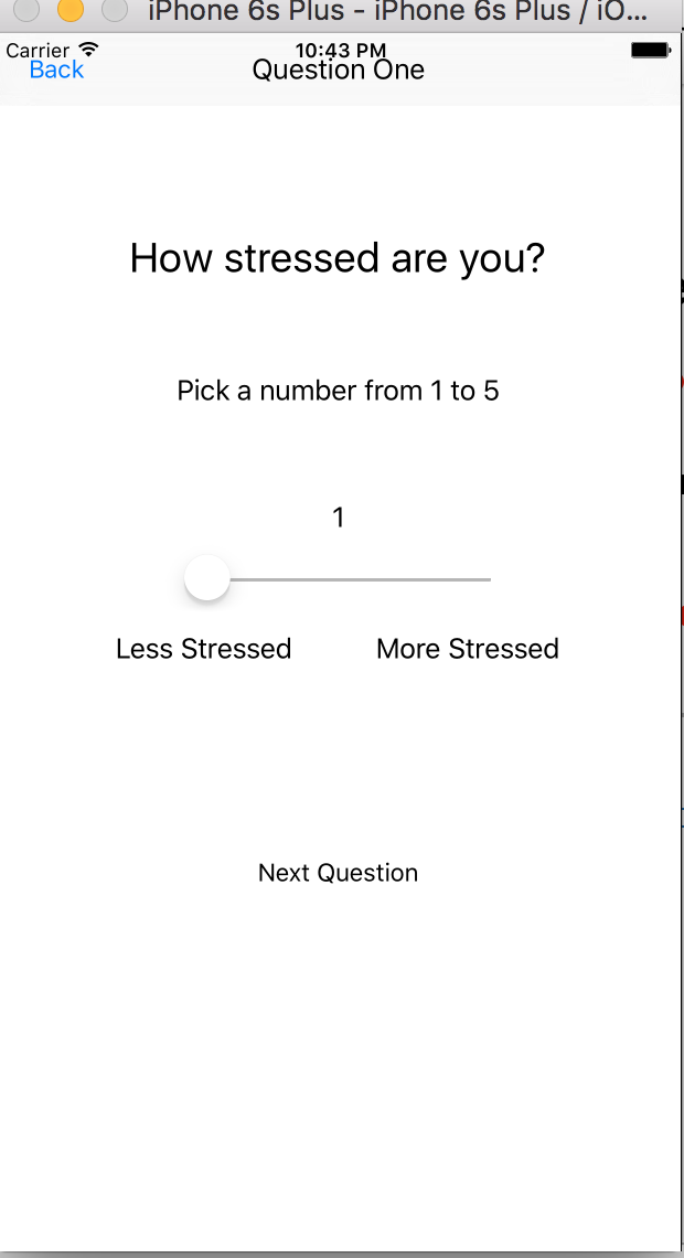
Do you know why Japanese train platforms have a blue light installed at their end? I was surprised to learn that it's sole purpose is to prevent people from jumping in front of oncoming trains, and thereby reduce the suicide epidemic in Japan!  


While researching for my project, I was fascinated to learn that color is one of the most powerful tools in the world. Color impacts our psychological state of mind, our perception, our creativity and our cognitive skills. Every color inflicts a different effect on our moods and emotional responses.   


Blue is the most popular color around us, whether in the skies, national flags, our old comfortable jeans or in the icon-world. Its symbolism is complex and paradoxical. While 'feeling blue' implies depression or sadness, the color also evokes feelings of calmness and serenity, and is associated with freedom, imagination and confidence. I've therefore decided that blue will be the perfect background color for my app design.


This week was both challenging and fun, as I had an opportunity to learn a few new skills. I spent some time learning Adobe Photoshop and Adobe Illustrator. These are sophisticated and powerful tools to create professional graphics.  


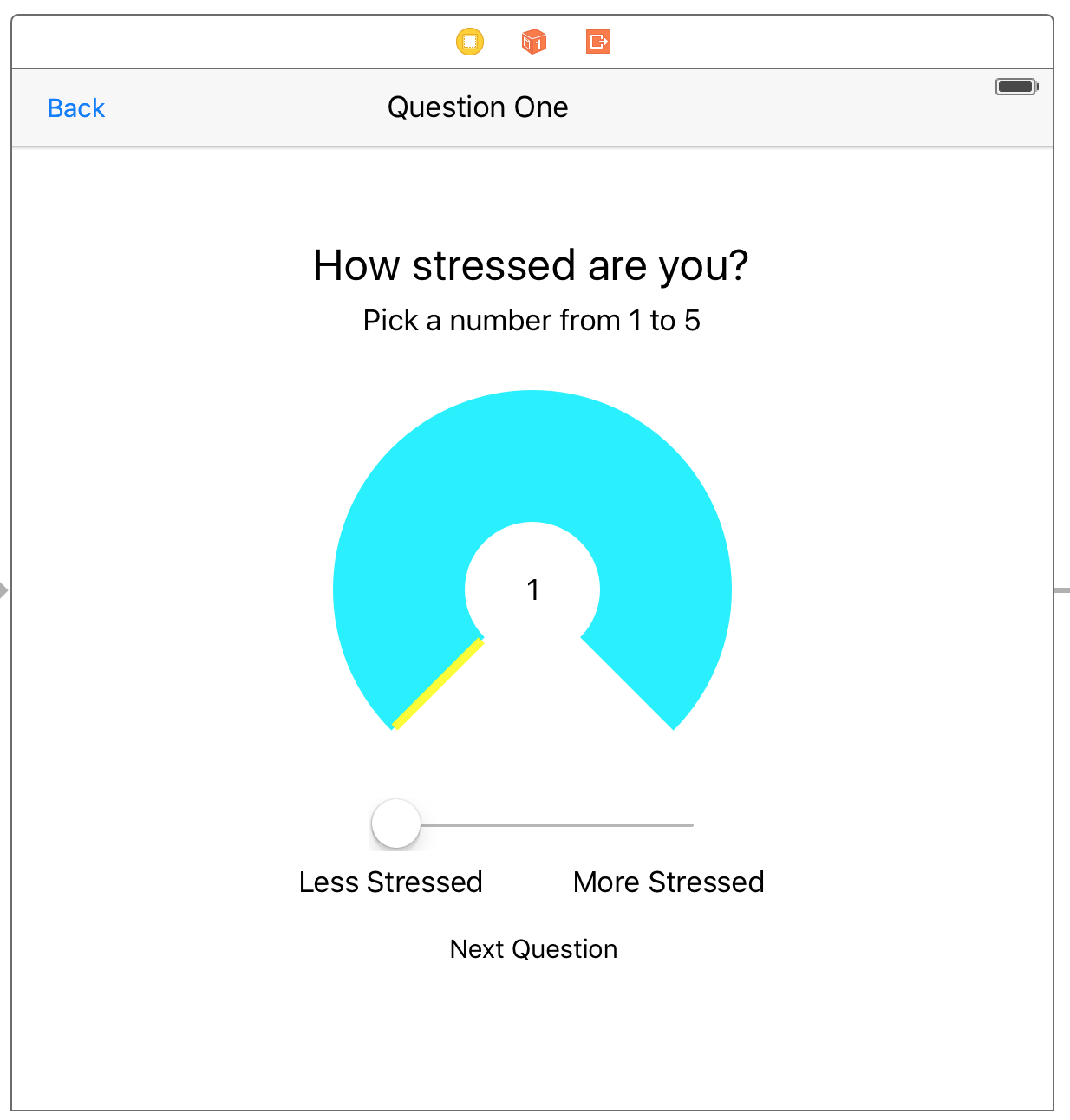
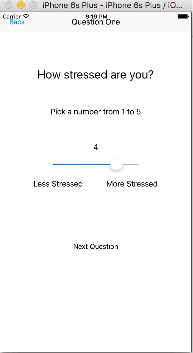
Besides coding, I watched a few tutorials on how to use photoshop. Once I got the handle of using this tool, I designed a few app icons. The app icon design should portray a person experiencing a stressful event. I have come up with a few designs, and posted the best one (so far) below.


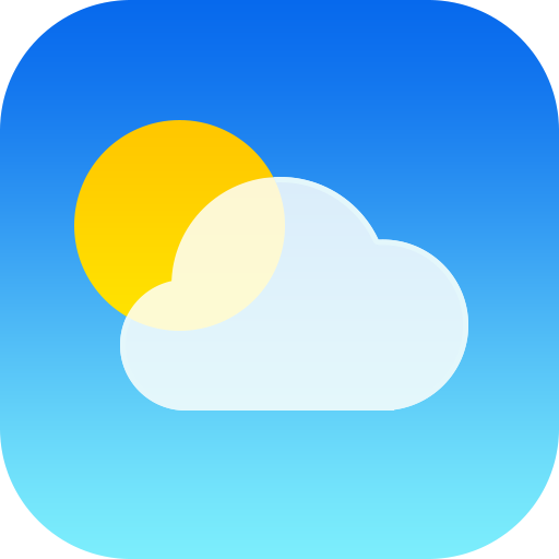
You may have also noticed that the backgrounds of app icons have different shades. For example, the official Apple weather app icon (displayed below) makes use of color gradients.  Using different shades of the same color makes the app design more dynamic. Brighter shades draw our attention, while darker shades help to create more depth and focus. I have used a similar concept of color gradients in different shades of light blue to add an illusion of depth, while maintaining a soothing appearance to the icon.


Here is Apple’s weather app icon:
iOS-7-weather-app-icon.png


Here is the draft icon I have designed so far.


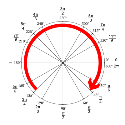
I also designed these images for the stress button. Please vote for the best one (1 or 2) in the comments.

1.


2.


I designed an animated background for the first 'stress' tab. When the user is stressed, they can tap the button, which then opens a page view. The series of pages will provide helpful coping tips and strategies. The animated background makes the app feel more dynamic and lively rather than a static white background.   

Next week, the last official week of the SRP, I am excited to wrap up the initial version of the app.

Friday, April 8, 2016

Week 8 (Apr 4 - Apr 8)

Hello blog viewers,


It is a misconception that all stress results in harm.

Did you know there are two types of stress? Distress is negative stress that results in mental and physical problems, while eustress or positive stress can motivate us, and improve our performance and energy. We can often channel stress from negative to positive, by changing our perception and using appropriate coping strategies. With this knowledge in hand, I have decided to add a ‘Coping Strategies’ section to my app.


The eighth week of my SRP has been the most productive and exciting, as I can finally see the app begin to take shape! 


I have added profile, stress, insights and coping icons to the bottom tab bar.


I have set the main icon for the app (which the user can see on his/her homescreen). I may change this as my App progresses, to portray a clear representation of its functions.


I have linked the core data of my first question to the first graph. Now, once the user inputs his/her stress event information, the app will automatically generate the graphs. 

Outside of coding, I enjoyed creating an image that I plan to use for the stress button. As this was my first experience using Adobe Illustrator, it was a bit challenging to create the perfect stress button. Here is my first attempt:

Not to stress too much about it, but this image wasn’t my best effort. After  trying to manually draw the perfect “S” by hand (or mouse?), I found a text tool where I could simply type the letter S and drag it on top of the circle (facepalm)!  So I proceeded to create a new icon below.


Screen Shot 2016-04-01 at 8.50.27 PM.png
A lot better but it still needs some fine tuning before I add it to the app. 

And finally to give you all a summary of the app, its basic function is to allow users to capture their stress events, and link the events to common triggers (ex: homework, examinations, public speaking, etc). We often go through many stressful moments in life, and seldom attempt to capture the specifics of any given stress event. The app will allow us to identify both intrinsic and extrinsic risk factors that may increase a person’s susceptibility to stress. A few examples of intrinsic risk factors are personality traits (ex: introvert or extrovert, perfectionist or complacent etc), while extrinsic factors may include a person’s level of activity, amount of sleep, and time spent on social media.  The app will also allow the user to capture their emotional state, behavior, and physical symptoms during a stress event. Using captured data, the app will be able to generate graphs to visualize patterns over a period of time. This information can then be used by the user and his/her healthcare provider to provide effective individualized management for stress. 


Next week, I plan on adding more questions to the app. I will also try and link them to the core data and create an algorithm which will calculate the user’s stress index.


Thanks for reading,


I hope to see you all in my next blog post!

Friday, April 1, 2016

Week 7 (Mar 28 - Apr 1)


Hello blog viewers,


Did you know that April has been designated as ‘National Stress Awareness Month’? This is a national effort to make people aware of stress and its harmful effects,  correct misconceptions, and provide them with successful coping strategies.


During this week, while researching more about stress, I learned that the origin of stress dates back to the early 1900s.  The word “stress” is derived from the Latin word “stringere” which means ‘to draw tight.’ and it was rats who helped us understand the concept of stress and its effects on the body. 


Hans Selye, an endocrinologist, used different methods to stress the animals, by exposing them to extremes temperature, starving them and making them exercise excessively. When he euthanized the animals, he found that the physical effects were the same regardless of the form of torture to which they were subjected.  This research has provided insight into the effects of stress and the importance of coping strategies.


There are several coping strategies we can adopt to avoid or minimize stress: taking time to unwind,  exercising, engaging with our family and friends, and providing community service. I hope to incorporate these strategies into my app in the next few weeks.


Now onto the work I have achieved in the seventh week of my SRP: I have finally created a graph that will show user’s stress levels; however I have not linked it to the core data yet. I have also decided to include only three tabs in the app: one for stress, one for graphs, and one for the user profile. This will improve the user interface, as the user will not have to keep switching between tabs to find what he/she is looking for.


The graph I have created will map the user’s stress level (from 1 to 5) throughout the past week (Sun through Sat). This task seemed daunting at first, but after reviewing a couple of tutorials, I managed to create a basic graph. There is a bit more work I have to do before the final graph is complete. Here’s a sample image of the weekly graph (The data shown is sample data and is not rendered from the core data yet):


I plan to display the stress event count and average stress level for the given period of time show in the graph (in this case, a week).  For the initial version, I will have multiple graphs that show weekly, monthly and yearly stress level data.


Over the next week, I plan to work on creating a monthly graph and a yearly graph and connecting the core data to all of the graphs.  I will also review the Human Interface Guidelines from Apple as this is a critical component of any mobile app that focuses on UI/UX design of the mobile app.


I hope to see you all in my next blog post!

Friday, March 25, 2016

Week 6 (Mar 21 - Mar 25)

Hello blog viewers,
I have just completed the sixth week of my SRP. During this week, I completed researching causes of stress (which I am in the process of converting into questions for the app) as well as coding more animations which will enhance the user interface.


While researching, I found many sources of stress which I would not have been able to come up with off the top of my head such as marriage; marriage, along with many other happy experiences in people’s lives, can be stressful due to new responsibilities and new environments (such as where a person is living). I also found more obvious sources such as bullying, unsafe environments, and lack of sleep. I have compiled twenty questions (with a few slightly overlapping ideas) and would like to cut down on them until I have roughly ten focused questions which will get key information from the user without wasting his/her time.


On the coding side, I finally got the animation working for the core graphics in the first question (which I discussed more in last week’s blog). "You can see it for yourself in the video below" is what I would say if blogger would allow me to upload the video (which is smaller than the 100 MB limit). Instead, I have just provided a few pictures in a time-lapse fashion and you'll have to imagine the actual animation.


After completing this animation, I added the core data files which I coded in a separate Xcode project to the main project which has the actual visuals and animations. This caused a few issues including the test app build failing to run due to a “Thread 1 signal sigabrt” error (this general error has popped up many times for). I looked over all of my code trying to find the cause for this error. I eventually found code for an unused outlet that I had forgotten about; I deleted the code and the app was running again. After overcoming this hurdle, I connected the user input values to the core data so the app will save answers. This is a key part of the app because if the app can’t remember the user’s answers for each stress event, the app will not be able to do what it’s designed to do: display graphs (using the collected data over a period of time) and present stress patterns to help the user and his/her healthcare professional, thus rendering the app useless.


This next week, I plan on narrowing down my final list of questions, working more on the core data, and adding more animations to the app.


I hope to see you all in my next blog post!

Friday, March 18, 2016

Week 5 (Mar 14 - Mar 18)

Hello blog viewers,
I have just completed the fifth week of my SRP, last week being my spring break. This week, I spent a lot of time on the core data for the app (where all the user’s answers will be stored into the app) and started learning (raywenderlich.com has been a great help again) and working on coding some core graphics. Core graphics are displayed in a UIView. They can be coded to display a visual image, hence the “view” in UIView. For example, I can code a circle image with the line of code:
override func drawRect(rect: CGRect) {
 var path = UIBezierPath(ovalInRect: rect)
 UIColor.greenColor().setFill()
 path.fill()
}
Although this code does say “oval”, if I set the view’s width and height equal to each other, then the “oval” will look like a circle. This code also shows how to set a basic color for the circle. Custom colors can coded using UIColor(red: x, green: y, blue: z, alpha: w). I use this website: http://uicolor.xyz/#/hex-to-ui in order to pick a color and get values for x, y, z, and w. An example of this is Screen Shot 2016-03-17 at 9.59.55 AM.png equalling UIColor(red:0.12, green:0.83, blue:0.88, alpha:1.0). With this simple line of code and a website, I have access to any color I want.

Although coding core graphics is an optional part of this app, I think that it will produce a more dynamic user experience since users will be able to visualize questions and their answers more. For example, I have started working on a moving image that will better visualize when a slider is used.
Screen Shot 2016-03-17 at 9.36.16 AM.png
When the user slides (the slider) left to right, the yellow bar in the UIView (with the 3/4ths circle) will move left to right to show an increase in the stress value along with the number in the center showing the exact value. So far, I have only coded the UIView, but have not been able to make the yellow bar coordinate with the slider proportionally. Coding the core graphics of the UIView required some math in order to code part of the circle and not the whole circle.
Unite Circle.png
I had to code for the “stroke” to have a starting angle of 3π/4 and ending angle of π/4. This results in a 270º angle circle. After that, I coded for the outline (the yellow part) of the 270º circle.

These next few weeks both are exciting and stressful since many colleges are releasing their regular decision admissions. While stressing over college decisions, I will continue to work on core data of the app and working on adding core graphics to more parts of the app, including the main “stressed?” button. I hope to see you all in my next blog post!

Friday, March 4, 2016

Week 4 (Feb 29 - Mar 4)

Hello blog viewers,
I have just completed the fourth week of my SRP. During this week, I focused on programming the core data of the app. The core data of the app is where I will be storing all of the answers to the stress related questions from any stress incident. These answers will be stored, converted to numbers, and displayed in the form of graphs. The core data will store data in a “persistent store”.  In other words, if the app is terminated completely and the user restarts his/her mobile device multiple times, the app will retain this information. Each stress incident will capture series of stress related data and the app will compile this data and present it in a graphical user interface. Since the app revolves around retaining stress data from each stress incident, this is the key part of the app. As you may imagine, such a key sub-system requires a lot of careful design and coding. I have never worked with core data before so I have been learning about it and have not gotten to code as much as I would have liked. I found the tutorials on www.raywenderlich.com to be particularly helpful for any of you other Swift coders out there. There is a lot more coding to be done for the core data of the app which I plan to work on next week.  

I also worked on passing variables and constants between view controllers. Each view controller can have its own individual variables and constants (which the programmer codes). However, these variables and constants are not globally shared between all of the view controllers. There are exceptions to this when you only need one instance of an object to live during the lifecycle of an app. These objects are often called “singleton” objects, as you can imagine from the name, a single instance of the object exist during the lifecycle of the application. I have been programming the app so that each view controller passes any necessary variables to the next view controller.

After coding for awhile, I set out to test whether my code worked. I created a label in a view controller after the stress rating (from 1 to 5) question (in a previous view controller). I set up the label so that it would show the number that the user selected (on the previous view controller) on how stressed they felt. After programming this into the app, I tested it out.

I ran the test build and went to the stress rating question. I selected a random number (four in this case) and hit the “Next Question” button, fingers crossed.

Hooray! As you can see, the label (in green text) is showing four, the number I selected in the previous view controller. This may not seem like much, but passing variables and constants between view controllers was a week long struggle for me where I came across countless errors which I had never faced before. Finally conquering this vital piece of code was a huge relief.

As a side note, I also added a pop up alert which comes up whenever the user taps on the “Finish” button after completing the stress incident survey. Here’s a picture of it:

This next week, I plan on continuing learning and coding the core data for the app (and hope to make significant progress). The coding is getting more advanced and intense every day! As I’m developing this app, many new ideas for the app arise to the point that I have started keeping a list of different ideas and adopting the feasible ones and hope to incorporate some of the more advanced ideas for future releases.

I hope to see you all in my next blog post!

Friday, February 26, 2016

Week 3 (Feb 22 - Feb 26)

Hello blog viewers,
I have just completed the third (and most productive thus far) week of my SRP. During this week, I completed the basic framework for my app (which includes setting up buttons and files for each of the four tab views in my app). I also realigned all of the buttons and text in the app so it doesn’t look ugly.


Screen Shot 2016-02-25 at 6.21.43 PM.png
This is what a view controller looks in the Main Storyboard (where I put all the basic buttons, labels, and text) of Xcode. However, if I run the app, the view of the app (in an iPhone simulator) looks like this:
Screen Shot 2016-02-25 at 6.24.48 PM.png
This is both ugly and fails to display the entire view with all of the buttons and labels that I want to display. Once I added constraints (which lock all of the buttons and labels in the app’s view), the app looked like this:
Screen Shot 2016-02-25 at 10.43.01 PM.png
Much better, right? This makes the app more uniform, neat, and easy to use (note that this view is not finalized and will be improved upon as I work on the app during the next few weeks). I had to rearrange a few labels in order to make all of the buttons and labels fit neatly since the “Less Stressed” and “More Stressed” labels were not ‘constraining’ horizontally. This view also shows a newly added slider which I added for one of the questions where users can pick a number from 1 to 5 rating how stressed they are. The number (label) above the slider shows what number the slider is indicating.
I have not completed the list of questions I will ask users regarding their stress. I have not gotten a chance to create the graphs as I still have not figured out how I will convert answers to numbers. I also realized that the aesthetics of the app (which I said I would work on this week in the last blog) are not as important as function and they can be implemented once the app is fully functional, hence why the pictures above show black and white.


This coming week, I aim to finish up the Settings tab and hopefully complete a (draft) list of questions and add them to the app. I will also start converting answers to numbers (although the values of the numbers will most likely change later).

I hope to see you all in my next blog!

Friday, February 19, 2016

Week 2 (Feb 15 - Feb 19)

Hello blog viewers,

Did you know that stress in known as ‘the silent killer’? It can result in heart disease, stroke, obesity, depression, and other health problems.

-Source: Web M.D.

I have just completed the second week of my SRP. During this week, I researched about common sources of stress, how to measure stress (which will aid me in focusing on the content in my app design), and how I can convert answers to numbers which I can use to compile data which will be displayed on graphs. I still have to research a lot more before I can figure out how I will transform qualitative questions to quantitative analytics.

Speaking of the graphs, I was thinking of the best types of graphs to use, to display the user’s stress information. I decided to have -- at the minimum -- a pie graph or a bar graph (to show the most common stress triggers experienced by the user), line graphs (to show when and where the user was stressed), and a bar graph which scales how high the user’s stress levels were for the duration that the data was entered.

I also made the basic framework of the app which I will build upon in the next few weeks. This basic framework includes creating the stress button (which users can tap whenever they feel stressed), setting up the basic view controllers in each of the four tabs of the app (discussed in my week one post), and setting up a table view for the settings tab.

This image shows an example of a tableview (which the settings tab will have). This view will allow for the best user interface for the settings. The other tabs will not necessarily use this view; they will use buttons, labels, and images to display information and questions.

While I was starting to make the basic framework for the app, I ran into one big problem in Xcode, where Xcode thought each of my newly created View Controllers had a header file (.h file which is used in Objective-C coding) instead of a swift file (.swift which is used in Swift coding, hence the name). Once I resolved this issue, coding was much smoother and I successfully coded the tab view controller logic (conditional -- if else -- statements).

I plan on completing the the basic framework for each of the four tabs by the end of next week. This will include basic functions in each of the tabs. I will also work on making the app look better aesthetically (since it is just a plain white background with blue buttons and labels at the moment).

I hope to see you all in my next blog post!

Friday, February 12, 2016

Week 1 (Feb 8 - Feb 12)

Hello blog viewers,

I have just completed the first week of my SRP. During this week, I refreshed myself on the basics of Swift coding including functions and classes. I also worked out some of the details of the app layout; I will be using a Tab Bar View Controller (which presents a screen with multiple tabs on the bottom bar) along with a Navigation Bar at the top of the screen (which will make it easier for the user to navigate in the app).

Screen Shot 2016-02-12 at 8.13.39 AM.png

This image (just for illustration) shows a Tab Bar View Controller (in the main storyboard in Xcode). The arrow on the far left indicates that the Tab Bar Controller screen will be the first view the user will be presented after opening the app. Once the user sees this screen, he/she can tap one of the two buttons on the bottom tab which will change the view of the app to either the first or second view (depending on which button is tapped).


I have also worked out some of the details regarding how the app will collect data regarding the user’s stress levels. When the app is opened for the very first time, the user will take a short demographic questionnaire which will ask for information such as age, gender, email, and occupation. This will complete the user profile for the app to unlock all features of the app. However, if the user chooses not to complete the profile, the app will allow user to play with limited features. Once the questionnaire (user profile) is completed, the app will adjust the way it computes stress data from the user (based on answers from the questionnaire). After completing the one-time questionnaire, the app will ask the user to tap a button when they are feeling stressed.


I plan to put this stress button in the center of the screen, and, when tapped, for it to allow the user to input information such as why he/she is feeling stressed, how stressed he/she feels (on a scale from 1 to 5), and when and where he/she was when he/she felt stressed. This list will grow as I develop the app further. I hope to make this a short series of multiple choice questions with minimal free text. This information will be taken and presented to the user in the form of graphs which will present when, where, and why he/she was most stressed. I also plan on making a way for this information to be sent to the user’s doctor (if the user chooses to), allowing the doctor to see the patient’s stress levels throughout the weeks and months up to an appointment.


I hope to see you all in the next blog post!