Friday, February 26, 2016

Week 3 (Feb 22 - Feb 26)

Hello blog viewers,
I have just completed the third (and most productive thus far) week of my SRP. During this week, I completed the basic framework for my app (which includes setting up buttons and files for each of the four tab views in my app). I also realigned all of the buttons and text in the app so it doesn’t look ugly.


Screen Shot 2016-02-25 at 6.21.43 PM.png
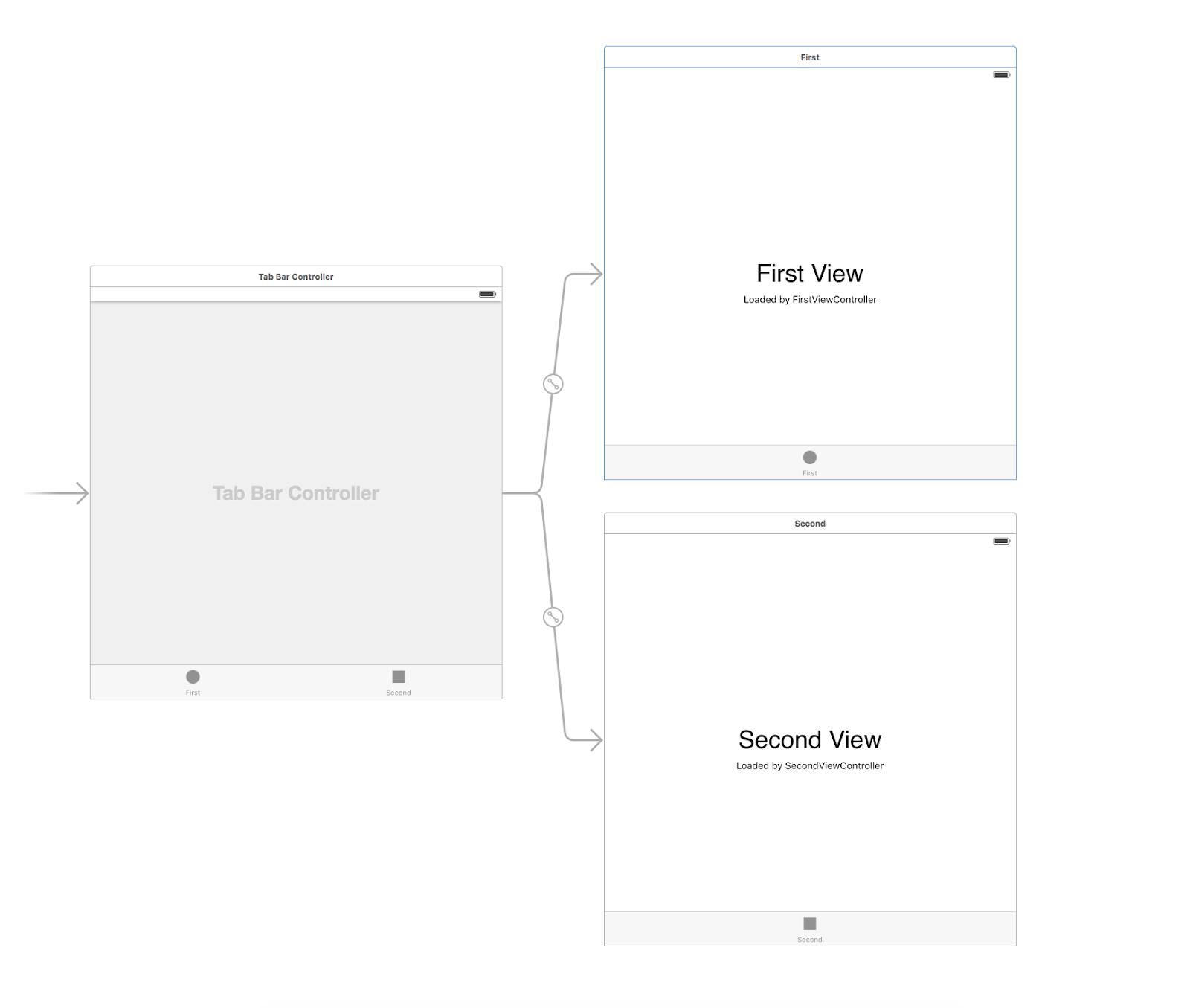
This is what a view controller looks in the Main Storyboard (where I put all the basic buttons, labels, and text) of Xcode. However, if I run the app, the view of the app (in an iPhone simulator) looks like this:
Screen Shot 2016-02-25 at 6.24.48 PM.png
This is both ugly and fails to display the entire view with all of the buttons and labels that I want to display. Once I added constraints (which lock all of the buttons and labels in the app’s view), the app looked like this:
Screen Shot 2016-02-25 at 10.43.01 PM.png
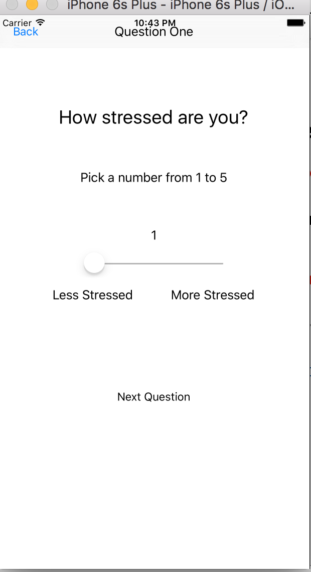
Much better, right? This makes the app more uniform, neat, and easy to use (note that this view is not finalized and will be improved upon as I work on the app during the next few weeks). I had to rearrange a few labels in order to make all of the buttons and labels fit neatly since the “Less Stressed” and “More Stressed” labels were not ‘constraining’ horizontally. This view also shows a newly added slider which I added for one of the questions where users can pick a number from 1 to 5 rating how stressed they are. The number (label) above the slider shows what number the slider is indicating.
I have not completed the list of questions I will ask users regarding their stress. I have not gotten a chance to create the graphs as I still have not figured out how I will convert answers to numbers. I also realized that the aesthetics of the app (which I said I would work on this week in the last blog) are not as important as function and they can be implemented once the app is fully functional, hence why the pictures above show black and white.


This coming week, I aim to finish up the Settings tab and hopefully complete a (draft) list of questions and add them to the app. I will also start converting answers to numbers (although the values of the numbers will most likely change later).

I hope to see you all in my next blog!

Friday, February 19, 2016

Week 2 (Feb 15 - Feb 19)

Hello blog viewers,

Did you know that stress in known as ‘the silent killer’? It can result in heart disease, stroke, obesity, depression, and other health problems.

-Source: Web M.D.

I have just completed the second week of my SRP. During this week, I researched about common sources of stress, how to measure stress (which will aid me in focusing on the content in my app design), and how I can convert answers to numbers which I can use to compile data which will be displayed on graphs. I still have to research a lot more before I can figure out how I will transform qualitative questions to quantitative analytics.

Speaking of the graphs, I was thinking of the best types of graphs to use, to display the user’s stress information. I decided to have -- at the minimum -- a pie graph or a bar graph (to show the most common stress triggers experienced by the user), line graphs (to show when and where the user was stressed), and a bar graph which scales how high the user’s stress levels were for the duration that the data was entered.

I also made the basic framework of the app which I will build upon in the next few weeks. This basic framework includes creating the stress button (which users can tap whenever they feel stressed), setting up the basic view controllers in each of the four tabs of the app (discussed in my week one post), and setting up a table view for the settings tab.

This image shows an example of a tableview (which the settings tab will have). This view will allow for the best user interface for the settings. The other tabs will not necessarily use this view; they will use buttons, labels, and images to display information and questions.

While I was starting to make the basic framework for the app, I ran into one big problem in Xcode, where Xcode thought each of my newly created View Controllers had a header file (.h file which is used in Objective-C coding) instead of a swift file (.swift which is used in Swift coding, hence the name). Once I resolved this issue, coding was much smoother and I successfully coded the tab view controller logic (conditional -- if else -- statements).

I plan on completing the the basic framework for each of the four tabs by the end of next week. This will include basic functions in each of the tabs. I will also work on making the app look better aesthetically (since it is just a plain white background with blue buttons and labels at the moment).

I hope to see you all in my next blog post!

Friday, February 12, 2016

Week 1 (Feb 8 - Feb 12)

Hello blog viewers,

I have just completed the first week of my SRP. During this week, I refreshed myself on the basics of Swift coding including functions and classes. I also worked out some of the details of the app layout; I will be using a Tab Bar View Controller (which presents a screen with multiple tabs on the bottom bar) along with a Navigation Bar at the top of the screen (which will make it easier for the user to navigate in the app).

Screen Shot 2016-02-12 at 8.13.39 AM.png

This image (just for illustration) shows a Tab Bar View Controller (in the main storyboard in Xcode). The arrow on the far left indicates that the Tab Bar Controller screen will be the first view the user will be presented after opening the app. Once the user sees this screen, he/she can tap one of the two buttons on the bottom tab which will change the view of the app to either the first or second view (depending on which button is tapped).


I have also worked out some of the details regarding how the app will collect data regarding the user’s stress levels. When the app is opened for the very first time, the user will take a short demographic questionnaire which will ask for information such as age, gender, email, and occupation. This will complete the user profile for the app to unlock all features of the app. However, if the user chooses not to complete the profile, the app will allow user to play with limited features. Once the questionnaire (user profile) is completed, the app will adjust the way it computes stress data from the user (based on answers from the questionnaire). After completing the one-time questionnaire, the app will ask the user to tap a button when they are feeling stressed.


I plan to put this stress button in the center of the screen, and, when tapped, for it to allow the user to input information such as why he/she is feeling stressed, how stressed he/she feels (on a scale from 1 to 5), and when and where he/she was when he/she felt stressed. This list will grow as I develop the app further. I hope to make this a short series of multiple choice questions with minimal free text. This information will be taken and presented to the user in the form of graphs which will present when, where, and why he/she was most stressed. I also plan on making a way for this information to be sent to the user’s doctor (if the user chooses to), allowing the doctor to see the patient’s stress levels throughout the weeks and months up to an appointment.


I hope to see you all in the next blog post!